| Show/Hide Hidden Text |
U |
Choose From Category - prompts the cashier to pick an inventory item from a category list. This button is usually on a page by itself. It does not need to be colored or enhanced in any way because it will never be seen by the cashier. (see sample page Choose Button) (see Pre-Defined ) |
Strictly a design tool for Touchscreen, but it will save much time for cashiers and touchscreen operators.
The button is placed on a separate page all by itself. It does not need to be sized or colored, but it must have the correct properties to include the name of the category in question. Also important is that on a Main Page a Jump To button will link to this separate page. The jump to button is usually titled with the name of the category.
For example,
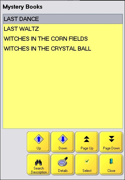
These are all of the products in the Mystery Category.
Highlight one and choose Select. You will be returned to the main page and the item is added to the invoice.

Buttons for use
- Up - moves cursor up one line
- Down - moves cursor down one line
- Page Up - moves cursor up one screen full
- Page Down - move cursor down one screen full
- Search Description - enter beginning characters of description
- Details - shows picture, stock status, and available note about the item
- Select - adds highlighted item to the invoice
- Cancel
Special Instructions
Invoice Style Button (Not Applicable)
There is no such button, but the equivalent option is on the Locate Item screen and you can filter the list by a specific category name. |
Register Style Button (Not Applicable)
There is no such button, but the equivalent option is on the Locate Item screen and you can filter the list by a specific category name. |
As described above |